Ben Horley G321
Thursday, 29 April 2010
Looking back at your preliminary task (the continuity editing task), what do you feel you have learnt in the progression from it to the full product?
You can see that in the short scene we filmed a conversation between Matt and Chris to get an idea of how different shots can be used to give a different feeling to what is happening on screen. We experimented using over the shoulder shots so the audience could see the reactions and emotions of the characters. It then goes to a mid shot of the two characters so the audience can establish where the conversation is taking place. We emphasised the sound of Matt's phone and used a POV shot so the audience feel they are the character and get emerged in the story. We used continuity editing to show Matt walking threw the door and then a long shot showing where the character is walking to. This was the first time any of us had done anything like this and i believe the editing is very good.
Detainment
Detainment was our final piece and if you look at it to compare with our first film the conversation you can see that the techniques we used in the first film were re used in the final piece. Continuity editing was very apparent in both of the films when the characters use the doors to enter and exit buildings. The conversation was shot in the same way as well using over the shoulder shots. We have then used a close up of the handle when Matt tries to escape from the room this is also like when Matt answers his phone in the preliminary task. Things such as non diagetic sound were added into the final piece which we didnt have in the preliminary tash which i believe adds alot to the film such as tension.Finally there is a mid shot of Matt just before he attacks the board; this is a good shot because it shows his emotion.
Audience Feedback
grreesbutt- over all i think there is a good use of camera shots and movement e.g. long shots medium shots tacking and canted angle shots. The things that could be improved could be that when the evil guy slits Matt's throat he should have done it with the sharp edge of the knife instead of the blunt side to give a better sense of verisimilitude (authenticity).
Chris olney- I really liked this film, i felt that the music went well with the scene and also the flickering lights was also really good. If there was one thing that you could improve on would be by using more fake blood as there was only a little bit but other than that, AWESOME!!
Tony- really liked the film, i liked the high angle which shows that the character is vulnerable also it seems like he is being watched by someone.
Tom- nice lads i like it.
Jamie- pretty good, i enjoyed the scene when the lights are flickering and the killer is slowly moving towards Shaun. I thought that the killing scene was good but maybe you should of used a fake knife so that you would be to use the right side of the knife, but still looks good.
Max- good film, not to sure about the end where the killer gently drops Shaun on the film also using the wrong side of the knife, but other than that i think you used good camera shots and movements throughout the film. The music also worked well i thought.
The final outcome of the film could of been improved if we had changed the murder scene as we had to use the wrongside of the knife byt we thought using a real knife was important and a fake knife would of not givin the look we wanted the scene to have. We were very pleased with how people viewed the camera shots we decided to use and how we edited all the shots together.
What have you learnt about technologies from the process of constructing this product?
We have used:
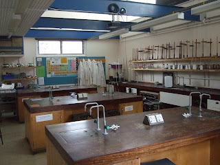
school premises - We have used the school premises to produce our film. We used one of the old science blocks to make it.
School supplied camera and tape - We used the tape and camera to record our opening 2minutes of the film.
kitchen knife - We used a kitchen knife which the school provided for us for our last scene.
Tripod - We relied on the tripod to produce steady shots which improved the quality of the footage.
Adobe - We used Adobe Premiere 8 to edit and construct our opening two minutes.
School and Home computers - To edit and upload the film, also updating new features onto our blogs
Who would be the audience for your media product?
What kind of media institution might distribute your media product and why?
 A media institute that i believe would be best suited to distribute the film we made would be 'Rogue Pictures', they have a long history in producing high quality horror films for a low budget and this is perfect for what we would need to create our film. In the past Rogue Pictures have released well known films such as all of the saw films, shaun of the dead, the strangers, the last house on the left and recently the unborn. All of them films would of been made on a low budget and then used 'Rogue Pictures' to advertise the film making it a well known film in the genre of horror, for that reason 'Rogue Pictures' has become a well known and respected company within the world of media. Rogue can also create conditions for making the movie, hiring the right personnel such as cast, directors and others and finally they can distribute the film out to their target audience. Rogue pictures would allow us to develop the film with enough financial backing that we would not need to get other larger companies to fund us and begin to take control of what happens and take more of the money made then we would originally would of given away.
How does your media product represent particular social groups?
Monday, 26 April 2010
In what ways does your media product use, develop or challenge forms and conventions of real media products? (i.e. of film openings)
Setting/location - The scene we decided to use was a old school room in the back of a science block. We had to do the filming inside school as this would allow us to use all the equipment rather than trying to take it all home to use at the weekend. This setting gave us the perfect place to complete the shots we wanted and believe would give us the best finished movie. The location was very old room in an old block so had a very scary interior and exterior which increased the scare factor without us having to create the eerie scenery.
Costumes and props - We spent a long time working out costumes as we wanted to create a believable Mise en scene so the audience would find it believable. To do this we decided Shaun (Matt Davison)the main character wears very typical clothing of a teenager, we see him in some scruffy jeans and a t shirt to make him look like a poorer member of the school who could have possibly done things that have made people very angry with him. In contrast to this we have a teacher (me) in a lab coat to show that he is an authoritative figure who has power over Shaun but we also make him look like more of a comical character by making him wear big glasses. The killer also wears a lab coat which could mean he is a teacher at the school or used it so that no one asks him who he is when entering the school but this uncertainty surrounding the character makes him a scary character. He also wears his hood up to conceal his face from the victims and also the audience so we can hide his identity till the end of the film. The main prop we used a knife with a pipet attached filled with fake blood that we used to make the murder scene look much more realistic.
Camerawork and editing - We decided to use basic shots like over the shoulder shot when Shaun is having a conversation with his teacher, also used is a high angle looking down on Shaun which shows that he is inferior. long shots, mid shots and close ups have been used during the killing scene. We tried lots of different shots so that we could see which one would be the most suitable for our film. With editing, we made sure that there is continuity throughout the film. When it is getting closer to the killing scene, we decided to use short quick cuts between different angles to show that the tension is building and also to make the audience feel uneasy and wanting to see what happens.
Title font and style - The font that we used for the writing during the opening two minutes was bold and black to make it stand out against the background, this was different to the font and style we used for the title 'Detainment', we faded the movie into a black screen and then used red to make the two contrast. We also decided to use red as it has the connotations of blood and danger which gives the film the image that we wanted it to have.
Story and how the opening scene sets it up - The story we decided on is a horror that takes place in a normal secondary school. In the opening two minutes we see a boy going into a detention then after the teacher leaving we see the killer enter the shot from behind him and slit his throat. This allows us to develop the story to show what the killer does next and if the body is discovered or we could go back in time and show the events that lead to the what we see in the first two minutes.
Genre and how the opening scene suggests it - As a group we decided that the best option for us would be to do a horror movie, this was because we felt we could get this genre across to the audience within the first two minutes rather than a comedy where it could be very unclear that we decided to do it as making people laugh is very hard. In the opening scene we used non diagetic sound and fast pace editing to make it clear it was a horror film.
How the characters are introduced - We introduce the first character Shaun by only seeing his feet and then by watching him through someone Else's eyes, this creates mystery around the character as we feel uneasy around him and unsure of his safety. We get introduced to the teacher for a few seconds by having him tell off Shaun for not completing work, this character is only present for one scene. The only other character we see is the killer but we never see his face, he is introduced when the lights are flickering giving the audience a fear of the character.
Special effects - The main special effect we use was a knife to cut Shaun's throat we attached a pepit to the back of it filled with blood so when you squeeze it and give the effect that his neck was actually being cut. We amplified the sound of the board shutter going up as we felt the audience maybe unsure of what was happening so making it louder emphasises what is happening.
Thursday, 22 April 2010
Evaluation
EVALUATION ACTIVITY 1
In what ways does your media product use, develop or challenge forms and conventions of real media products? (i.e. of film openings)
You should go through the final version of the project and select nine distinct frames which you screengrab and drop into a photoshop. You will be using these to write about how typical or not of opening sequences your particular design is, so choose them carefully.
Once you have the nine frames neatly in Photoshop, screengrab the whole thing and post to your blog, then write an analysis of how you have used such conventions.
The aspects we would like you to consider across your nine frames are:
The title of the film
Setting/location
Costumes and props
Camerawork and editing
Title font and style
Story and how the opening sets it up
Genre and how the opening suggests it
How characters are introduced
Special effects
EVALUATION ACTIVITY 2
How does your media product represent particular social groups?
Pick a key character from your opening. Take a screengrab of a reasonable sized image of them. Think of one or more characters from other films with some similarity to them (but maybe some differences too!), find an image on the web of that/those characters and grab it as well. Drop the two into photoshop, as a split screen. Export this splitscreen image as a jpeg then drop onto your blog and write about the similarities and differences in terms of appearance, costume, role in film etc.
So for example if you have a lone cop type character, look for other lone cops to compare him with...
EVALUATION ACTIVITY 3
What kind of media institution might distribute your media product and why?
For this question, you are going to do a 'director's commentary' style voiceover explaining some of the key features of your opening
You will need to script the voiceover which deals with institutional issues to include:
discussion of your production company name and logo and the role of such companies
What does a production company do?
The idea of a distributor and who that might be and why.
Where the money might have come from for a film such as yours
Why the various people are named in the titles- which jobs appear in titles and in what order and how have you reflected this?
What your film is similar to 'institutionally' (name some films which would be released in a similar way)
You need to refer to actual company names and processes so you will need to go back to the early posts on film companies and maybe do a bit more research
When you have scripted, record the voiceover using Final Cut on a new audio timeline, then export to quicktime and embed on blog.
EVALUATION ACTIVITY 4
Who would be the audience for your media product?
You should have a drawing/photo of your target audience member and an explanation of what kinds of taste they might have- where they would shop, what music they would listen to, what their favourite Tv programme would be, etc.
Make sure you have taken a photo of it, post it on the blog and write a few notes on why they would watch your film.
EVALUATION ACTIVITY 5
How did you attract/address your audience?
You will use YOUTUBE's annotation tools to add NOTES, SPEECHBUBBLES, and LINKS to your video:
http://www.google.com/support/youtube/bin/answer.py?hl=en&answer=92710
These annotations will highlight the ways in which your Film Opening links to other similiar films in order to attract the particular Audience you have previously identified.
Your annotations will refer to genre conventions, use of music, similiarities with other movies and what you have identified as the Unique Selling Point of your imaginary film.
EVALUATION ACTIVITY 6
What have you learnt about technologies from the process of constructing this product?
In pairs, take a picture of each other holding the kit you have used. This might just be the camera and tripod, and your PC but there may be other things you want in the shot.
Drop the image onto your blog and annotate it, adding all the programs and other technology you have used as screengrabs and what you learnt about it/from using it. Your written text need only be minimal. You could include reference to all the online and computer programs you have used such as youtube, flickr, blogger, adobe premier, etc.
EVALUATION ACTIVITY 7
Looking back at your preliminary task (the continuity editing task), what do you feel you have learnt in the progression from it to full product?
Concentrate on editing and camerawork.
Grab some frames from both tasks and put them on the blog and show what you know about shot types, edit terms and techniques.
Make sure you mention the 180 degree rule, match on action and shot/reverse shot
Thursday, 25 March 2010
Editing Part 2
I am very happy with how the film has turned out and believe we have managed to create a interesting production that has the ability to entice the audience from the start of the film.
Tuesday, 23 March 2010
Editing Part One
We knew we had to do a film of around two minutes and after our first filming session we thought that this would be further then we first thought but after the second session we ended producing around five or six minutes of usable footage, this has its pros and cons with the fact we have now finished filming and wont have to go out again but trying to edit it to just a two minute opening is very hard as we feel that we worked hard on every shot so don't want to cut any of them out.
We will have to discuss the possible shots we believe to be unnecessary and that we can get rid off but this may take a while for everyone to agree on the final outcome.
Thursday, 18 March 2010
Finished Filming
Filming the final piece of the film was the most difficult to shoot as it required shots that we only had one chance to complete due to the fact re creating the scene to get a good sense of mise en scene would have been impossible for us to do. Another problem was we needed to film things for a long period of time so we could speed them up in the final edit of the film, the problem with this is the fact that we were very cramped in a corner of the room and the slightest sound was being picked up by the camera. The only way to deal with that problem was to sit there in silence for extended periods of time in silence and just get through it.
We did also suffer a problem with teachers walking in and out of the room so we had to redo alot of the takes to make sure this didnt happen but this has meant we got the chance to do all shots more than once and get it as perfect as possible which will hopefully mean we end up with a better final piece.
Monday, 15 March 2010
15
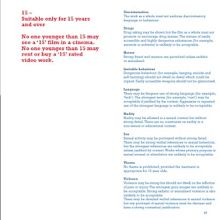
I previously thought that the film would be a 12 with minimal actual horror taking place but after realising the final scene will actually be a murder i thought id look if this changed the rating of the film. The script is very clean so we face no problems there but with this murder you see a knife cut someones throat with a large knife and then see blood come pouring from the cut so i think that this may be to graphic for under 15's but wont know till the scene is shot and edited whether the film will finish as a 12 or 15.
Wednesday, 10 March 2010
Filming Nightmare
Sunday, 7 March 2010
Audience Profiling
Thursday, 4 March 2010
Questionnaire Findings
Monday, 1 March 2010
Questionnaire
Gender? ...............
Favourite genre? ....................
Favourite film? .........................
Is the opening scene of the film the most important part of the film? (yes or no) ................
Why? ..................................................................................................................................................
Cinema or Rental DVDs? .....................................
What do you like most about your favourite genre? why? ....................................................
Props (final murder weapon)
Sunday, 21 February 2010
Murder Weapon
Wednesday, 10 February 2010
The beginning of Filming
Wednesday, 27 January 2010
Sound and Music
Tuesday, 26 January 2010
Detainment Poster
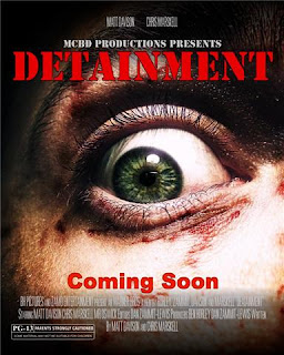 This is one of the ideas we have had for a photo of 'Detainment'. We think that having a poster is a very good idea to show what type of film is being made as well as what the audience can expect to see. This poster is good at portraying the horror aspect of the film, the close up of the eye shows the fear that the person is going through. The eye is slightly off centre to put the person looking at it off ease.
The credits at the top of the poster show the people that will be starring in the film whilst at the bottom we have the different production companies and the names of directors and editors to make it look as professional as possible.
The poster would be one of the main features of a marketing campaign if the film was released, this would be the first thing people saw of the film when they were out and about so it needs to be very eye catching. The poster has to draw them in and provide enough info mation e.g a website so that people could go home and be willing to search for it on their computer.
Shaun - I got a detention now so I'll be out later.
Friend on phone - Alright mate. see ya
Shaun enters the room
Shaun - Hi Sir
Mr Oswick - Sit down Shaun
Silence
Mr Oswick - I've just got to go to the staff room to pick something up
Shaun - Alright
Door closes as Oswick walks out, Shaun sits waiting, but then decides to get up and try and leave.
Shaun - The damn doors locked
Shaun pulls harder and harder try to open it, the lights flicker and go out but then come back on. He turns around as there is a sound from behind him, there's a message on the board.
Shaun - oh s***
He tries harder to get out. Amplified sound of foot steps coming up behind him. loud screaming of agony.
First Costume Ideas
The killer will be wearing dark old clothes to show that he maybe can't afford the latest fashionable clothes. He will wear a big black jacket with a hood to cover his face. He'll be wearing old ragged jeans and old trainers. So he will be completely the opposite to the victim Shaun McGee.
Mr Oswick will be wearing smarter clothes compared to Shaun and the killer. He will be wearing shirt and tie maybe a blazer, trousers and smart shoes.
Character Info
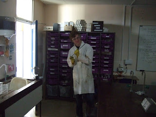 Shaun Mcgee – Shaun is being played by Matt Davison. Shaun is 16 years old and lives local to the school in a rough area. Living in rough area and not having a great upbringing and is usually singled out by others because of this. He is regularly finding himself in trouble at school either fighting or being caught smoking.
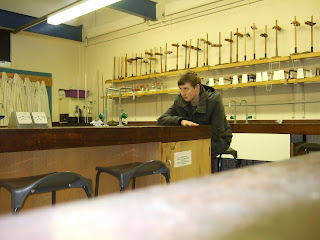
Mr Oswick (Teacher) – Mr Oswick is hopefully being played by Mr Oswick if not we will find someone to fill in. Sir is a usually fun respected teacher, dresses trendy and has a good relationship with his students but doesn’t let any student get away with not doing homework.
Detainment Plot
Monday, 25 January 2010
Shot List
2. Medium shot of him walking to his chair and of him sitting down
3. A close up of Shaun looking at the clock
4. Medium shot of the teacher telling Shaun that he has to leave
5. Tracking shot of him walking towards the door trying to get out
6. Close up of the handle with him frantically trying to get out
7. Low angle of him looking up towards the lights as they start to flicker before suddenly going out
8. Hand held camera of him then looking around panicking
9. Camera then arcs round as the lights then turn back on
10. Zoom towards the board where a message is written
11. Close up of his face to show the emotion
12. Hand held camera again of him trying to get out
13. Medium shot of Shaun with the killer coming up behind him
14. Zoom of the knife going towards his throat
15. Establishing shot of detainment
Production Company

We thought having a production company like Rogue Pictures would benefit us as we know that they specialise in horror films. Having it pop up before the bieginning of our film will add a scary factor as people associate them with films such as; the last house on the left, Seed of chucky and White Noise.
They specialise in low budget films usually spending between $1,000,000 and $45,ooo,ooo
Filming Ideas
Thursday, 21 January 2010
Storyboard!
The first picture shows how we will begin our film, a close up of someones feet that will create an air of mystery around what is happening and hopefully have the desired effect of unsetteling the audience.
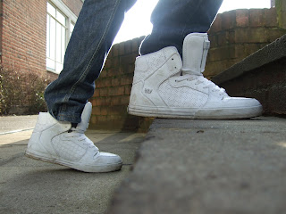
This second picture is a long shot that reveals who the mystery person was and shows that he is a student who goes to the school. By taking it from behind a bush it gives the audience the feeling that he is being watched by someone or something.

This third picture is a medium shot that shows the character going into an area that either he shouldnt be going in to or somewhere that is going to have dangerous substances inside. We have now established this charecter as a main charecter due to him being the only character we see for the first three slides.

This is a high angle/over the shoulder shot which gives a good view of what the character is doing and how bored his body language is. It also shows that he his all on his own with no friends around him.

This is when we become aware that he is in a detention and having the teacher go through work that he should of done at a previous date. At this point it would still be unclear to the audience that is a horror and would allow them to settle .

This is a low angle/over the shoulder shot that reinforces to the audience that he is bored and looking at the clock to see if he will be able to leave his knowing that he had a detention.

This is a long shot of of the teacher leaving the room and trusting him to behave and get on with the work. It may also suggest that he could get up to mischief whilst the teacher is not in the room.

This is a long shot of the door slamming shut with an echoing boom leaving him alone in a big classroom.

This is a medium shot showing the character seeing this as an oppertunity to leave the detention and go home. This is a close up of the character struggeling with the door and realising thazt it has been locked from the outside giving him no chance of leaving the room.
 This is where the horror aspect of it starts with the flickering of lights on and off, with the room becoming much darker it unsettles the audience and makes them re evaluate the security they felt with this opening sequence.
 This is a point of view shot just after the lights have come back on. We couldnt write on the board at that moment but their will be writing covering the bored telling the character of his death.
This is where we see a close up of the character really struggeling with the door trying to get to the freedom of outside.
 This is a highangle shot finally showing the killer that had been hidden in the room since the beggining, this is the main point of the opening sequence and what the rest has been building up to. The scene will finish with the main characters blood on the window after the killer has stabed him.
Ideas and Infomation
Mise En Scene and props
Many horror films are low budget films which is one reason for why our group decided to do horror. The choosing the right setting is one of the most important things to do in a horror film. The surroundings set the tone of the film and let the viewer know that it's a horror film. Popular choices for settings used in horror films are; woods, empty warehouse, school at night time, prison or an old house. Our group have decided to film in a school when it's quiet. This will make the viewer uneasy as the school should normally be busy and buzzing with students.
Not many horror films use many props unless there are bug horror films such as Saw. In Saw they use many props including death traps, pit full of needles and a playground roundabout which people are strapped to and killed. Typical horror film might only use props like;include are a knife, gun or some other kind of weapon and maybe a costume or mask for the killer/villain along with other normal everyday props. As we don't have a Hollywood budget we will be using props such as the ones listed above.
Plot
People are mostly frightened when they are watching horror movies because of the films thrilling plots, which are main things in this movie genre. A strong character is often used to make a thrilling plot. A lot of horror movies also haunt people by using plots which are related to supernatural. Also, a murderer or someone who is looking to get revenge is often a main character who kills other characters one by one, making people feel excited all the time they are watching. These are three typical horror elements found in many horror movies.
Our group haven't yet decided what the final storyline is going to be but we have got rough idea. One plot we have come up with is either a student or teacher is at school most properly after school. Someone else not sure who yet will be wandering around school trying to find the other person and once found them will end up killing them. We have not yet decided if they friends or if the killer chases after the victim etc.
Camera Work & Sound
The camera work and sound plays a huge part in making a successful horror film. Camera work can add to the tension and also make the viewer feel like they are part of the scene. In most horror films a popular camera angle is close up or POV (Point Of View). A close are often used to show tension and emotion on an actors faced. It can also be used to highlight something important in the scene such as a clue to the murderer or the murderers weapon. POV is often used to make the viewer feel like there are inside the character. This shot would often be used when the villain is being killed. By doing this it allows the viewer to seem more involved with the scene adds gives them an opportunity to see a murder through the killers eyes.
In horror films sound is a key part to add tension and put the audience on edge. How much suspense is added to a scene by sound is to do with how fast/slow and how loud/quiet it is.
For a scene where the murderer is looking for the victim, the soundtrack might be slow and quite as they are tip toeing about. Once the murderer has found the victim and maybe chasing after them the music would change and now be quite loud and have a fast tempo getting the audience heart racing and adding tension. Sound effects are also used frequently in horror films, for example the victim is being stabbed they might amplify the sound effect to make the scene seem more gory. A classic example of a sound effect in horror films is the creaking of the door, adding this in adds suspense and makes it seem eerie.
Our group have not yet decided on camera work or sound. These will most likely be done once the plot and settings have been finalised.
Monday, 18 January 2010
Preliminary Task
This was the first piece of filming that my group completed. The object of this production was to get use to filming people then learning to use the editing tools, as you can see at the end of the film we experimented with the effects you can use to enhance the production. I think that we did a very good job editing it smoothly especially when we had the person walking through a door.
Friday, 15 January 2010
Starting a new blog
Tuesday, 5 January 2010
The Cast
Killer - Chris Marskell
The Teacher - Ben Horley
Director - Dan Zammit Lewis
Producer - Ben Horley
Music created by Jamie Gamache
Ratings

The same criteria is used to classify '12' and '12a'. These catogories are awarded where the material is suitable, in general, only for those aged 12 and over. When the film is classified it shows that it may upset and distress children under 12 or there parents may believe it is unsutiable for them.
The '12a' category is specific to cinema films and gives the parent or gaurdians the ability to decide if they believe their child is mature enough to watch the film and understand its contents.
Location Ideas
Location Ideas
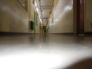
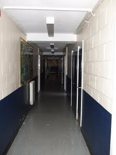
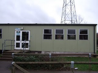
This is a possible location for our film, we liked this because it had a booming echo. These locations are very good due to the fact that we could use them without any interferance from other members of the school walking through the corridors or rooms. They also offer a scary effect which is perfect for us as we are creating a horror film.
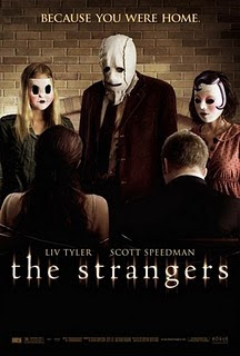
The Strangers
This is a film i watched that was the same genre as the film we want to produce, i watched the trailer as well as the movie to get some ideas on what different aspects you have to think about when trying to create a decent horror film. Watching this film helped me realise that we had to think of music, lighting, quick cuts and editing and how diagetic sound can be used to create an atmosphere that will scare the audience.
This film is about a couple in a remote holiday destination that get stalked then killed by a family of murderers in masks, they way they build up tension is by not really showing the murderers and rely on the tension being created by the audience waiting in anticipation of what could be around the corner and letting their own imagination create an image of horror in their own head. We think that this is a very good idea and may wish to use this technique in our own film.
This film has givin me alot of ideas that will help me to create a believable and scary horror film, ill have to watch it again and note down specific shots being used that will help and ill also watch similar films in the same genre that i believe can help.


